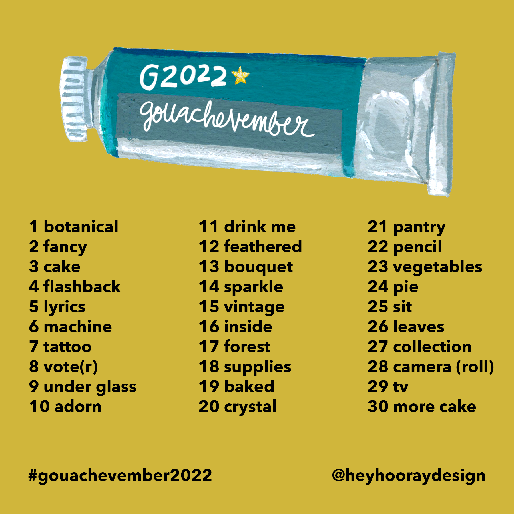
November 2022 will be the 5th anniversary of Gouachevember, the daily gouache painting challenge that I host on Instagram. The challenge has evolved a little bit over the years (mainly regarding my increased skill at not feeling guilty if I don’t complete all 30 days), but at core it remains a list of things I like to paint, and it turns out other people like to paint them too, and we all cheer each other on along the way.
5 years feels like kind of a big deal, so this year I am going to put my shoulder into it a little bit more, and try to at least paint more prompts than I did last year (made it about halfway before busy season got too busy) as well as sharing some video content that goes a little deeper into gouache than the quick painting process videos I regularly share on my Instagram account.
As far as prep goes, there are as many different setups as there are Gouachevember participants, and I love seeing how differently we all approach the challenge. Since I’ve mostly been working in acrylic gouache for the past few years, I’m sticking with it for Gouachevember, and I have pulled together the colors I want to use along with my favorite reliable sketchbook painting supplies. This list will probably evolve over the course of 30 daily paintings (I am already thinking about whether I want to add in colored pencil &/or acrylic ink detail work this year, plus also thinking that I will do whatever I want on any given day), but here’s where I’m starting:
Pencils & erasers. I will draw with just about anything, says the handful of pencils scattered across my desk. I have a pretty heavy sketching hand so my usual favorite pencil is Staedtler Mars H, since most gouache can easily cover the lines (and I don’t worry too much about visible work marks anyway). I prefer a soft eraser for most surfaces and especially for delicate paper (see below), and I buy Factis OV12s by the case.
Sketchbook. I like to work in a book for Gouachevember because I love having a finished thing when the month is over. 2022 will be my third year using an Arteza 8.25” square watercolor sketchbook — I think the paper is completely fine for the way I paint, I feel like the size is very manageable for daily work, and the square format is perfect for Instagram photos. I use a two-page spread (working side and painting side) for each day and since I use a couple spreads for prep work, the entire challenge fills the book perfectly.
I also really like that these books come in reasonably priced packs of two.
All of that said, there are definite downsides to using less expensive sketchbooks like the Arteza books: the binding doesn’t always hold up to heavy use, and for these books in particular, the paper is only coated on one side, so the spreads alternate between lightly textured coated and pretty fragile and absorbent uncoated (soft eraser is a must on the uncoated spreads!). This difference doesn’t bother me too much because I don’t use a lot of water in my gouache, but if you like to work with looser paint, these Arteza books might not be for you. (And, honestly, I would never recommend them for actual watercolor.)
Fancier personal fave sketchbooks are Moleskine and Handbook, watercolor sketchbook versions (thick paper, a little bit of tooth). On the rare occasion I want to work on perfectly smooth paper, I really like Stillman & Bern Zeta.
Tracing paper + washi tape. I just use this to keep my paint from transferring all over the place — especially important with traditional gouache, but I get transfer with acrylic too. I use a cheap pad of Crayola tracing paper and whatever cute tape I have around — though even washi can tear the uncoated Arteza pages, so beware.
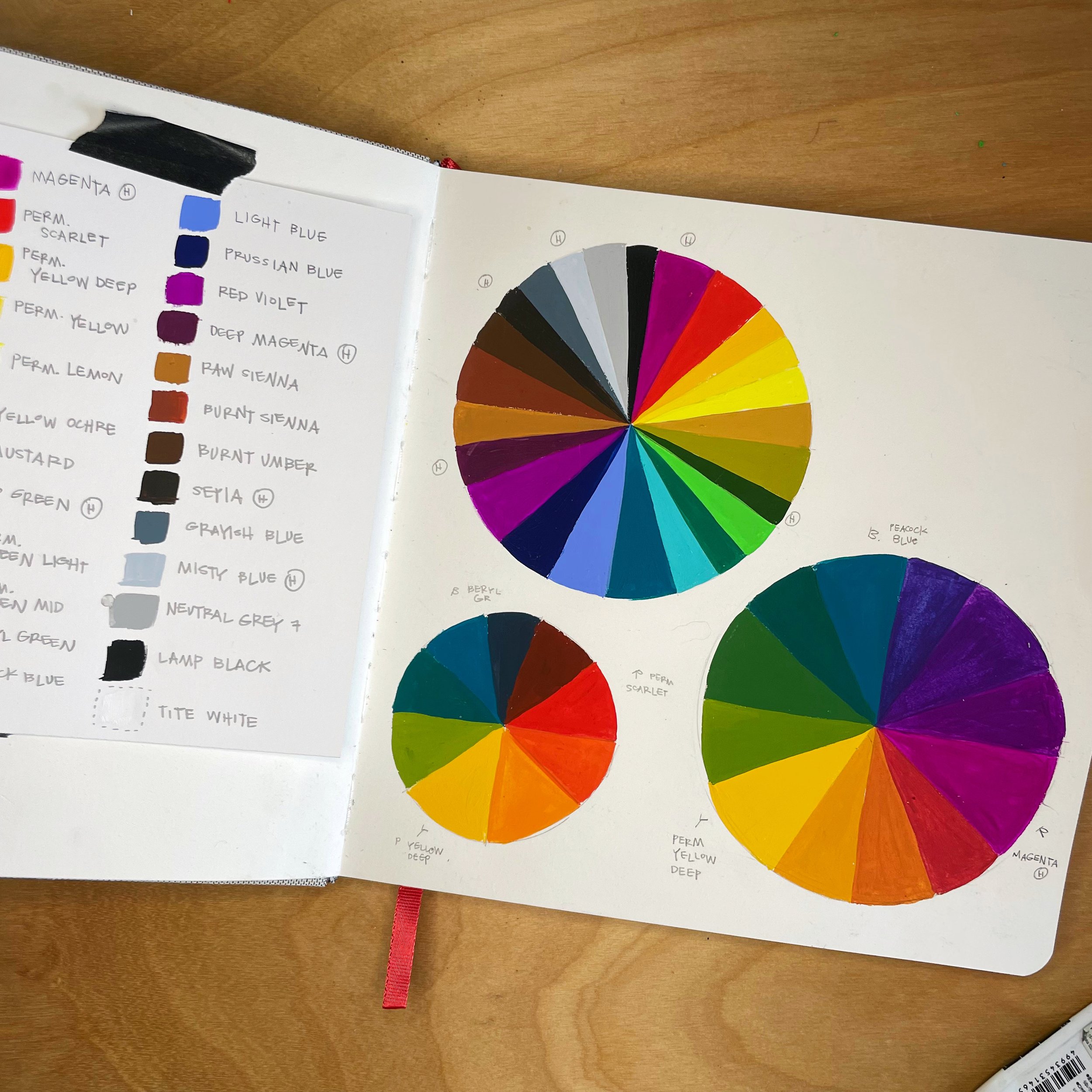
PAINT. Ok, this is the big one. This year I’ll be working with acrylic gouache, mostly Turner Acryl but a few Holbein Acryla colors that I can’t do without. I put together a “limited” palette of 25 colors, since my goal is to streamline my color choice-making but not to make the colors a challenge in and of themselves (I can do, and have done, a limited color challenge month, but it should surprise nobody to learn that I get super bored halfway through). This year I wanted my palette to have a rich, autumnal vibe, and my colors are:
Magenta (Holbein, very different than the Turner version.)
Permanent Scarlet (Turner)
Permanent Yellow Deep (T)
Permanent Yellow (T)
Permanent Lemon (T)
Yellow Ochre (T)
Mustard (T, again, very different than the Holbein version, which I also love)
Permanent Green Light (T)
Sap Green (H)
Permanent Green Middle (T)
Beryl Green (T)
Peacock Blue (T)
Light Blue (T)
Prussian Blue Hue (T)
Red Violet (T)
Deep Magenta (H)
Raw Sienna (H — pretty similar, maybe a little cooler than Turner, it’s just the tube I happen to have out right now)
Burnt Sienna (T)
Burnt Umber (T — though honestly I’d be using Holbein if I had any)
Sepia (H)
Grayish Blue (T)
Misty Blue (H)
Neutral Grey 7 (T)
Lamp Black (T)
Titanium White (T)
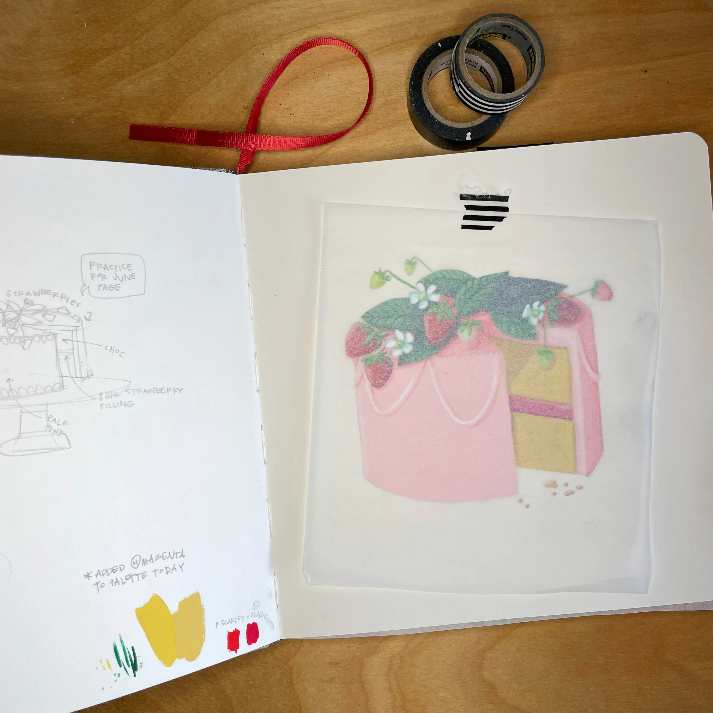
I’ve spent some time mixing colors and feel like this set is going to get me where I want to go — unlike last year’s palette, when I accidentally picked three paints that were different values of the same color and then only made it to day four before I cracked and added magenta to my color list. (It was that strawberry cake up above that did me in.)
Brushes! I like rounds and liners, am trying out a flat here and there, and I use a lot of small sizes. Simply Simmons and Princeton Select have been my go-tos for a long time, but this year I started using Trekell golden taklon brushed and LOVE them. I think that gouache is pretty forgiving when it comes to brushes, so my criteria is always: does it feel good to use? Can I control my water? Does it make the mark I want?
Also: water jar, spray bottle of water to evenly and lightly rewet paint on my palette, paint rags for wiping extra water off my brushes, palette pad (what I will probably actually use 90% of the time), Sta-Wet palette (will think about using but probably won’t set up), cool enamel or ceramic palettes that I will use when I want to feel fancy.
Remains to be seen but here’s what I’ll probably use if I decide to mix my media: acrylic ink & colored pencils. Sometimes I like everything to be gouache, sometimes I like to bring in shading and tiny details with other materials. Luminance are my hands-down favorite colored pencil, but I also actually really love the way more affordable Prismacolors. I sort of wander around through different ink brands and don’t use them enough to have a true favorite, but recently I really like Amsterdam, Sennelier Abstract (fluorescents and Payne’s Grey), and Holbein Acrylic Ink (for lumi colors and Super Opaque White).
Ok! That’s the list! I’m excited!


